
Typography is more than just selecting a font; it’s a key element of branding that communicates your message visually and emotionally. The fonts you use in your marketing materials can significantly influence how your audience perceives your brand. This blog dives into why typography matters and offers tips on picking the right fonts for your marketing strategy.
Typography’s Influence on Brand Perception
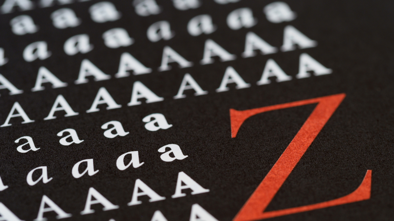
Fonts aren’t just decorative—they carry a unique emotional weight and help shape a brand’s identity. The typeface you choose can send powerful signals to your audience. For example:
- Serif Fonts: With their classic, structured lines, serif fonts like Times New Roman and Garamond give off a sense of tradition and reliability, making them ideal for brands looking to emphasize trust and stability.
- Sans Serif Fonts: Clean and modern, sans serif fonts like Arial and Helvetica are often used by companies that want to convey a fresh, contemporary, and minimalist image, perfect for tech and startup brands.
- Script Fonts: These fonts have a flowing, elegant look that can evoke feelings of warmth, luxury, and exclusivity—perfect for creating a personal touch or sophisticated brand image.
Creating Emotional Connections Through Typography
Typography goes beyond readability—it helps establish an emotional bond with your audience. A bold, strong font can evoke confidence and authority, making it an excellent choice for attention-grabbing headlines or calls to action. On the other hand, softer fonts convey elegance, which can be more suitable for luxury or lifestyle brands.
Well-chosen fonts also contribute to a better user experience by enhancing readability and accessibility. Fonts that are easy to read across multiple devices help keep your audience engaged with your message. After all, if your audience can’t read your content, they won’t stay around to interact with it!
Tips for Choosing the Perfect Font
When picking the right typography for your marketing materials, follow these practical guidelines:
- Align with Your Brand Personality: Your font should reflect your brand’s voice. A playful font might work for a children’s toy store but would be out of place for a corporate law firm.
- Limit Your Font Variety: Stick to no more than two or three fonts—one for headlines and one for body text—to keep your materials looking professional and cohesive. Using too many fonts can create visual clutter and distract from your message.
- Prioritize Readability: Choose fonts that are easy to read on all devices, from smartphones to desktops. Ensuring proper font size for headings and appropriate line spacing will boost readability, keeping your audience engaged with the content.
- Mind the Color Contrast: Always choose text color that stands out against the background. Dark text on a light background or vice versa is a simple yet effective way to ensure clarity, especially when printing materials that may not reproduce colors accurately.
- Test for Versatility: Don’t forget to test how your chosen fonts look across different mediums. A font that shines online might not have the same impact when printed on physical brochures or posters.
Wrapping Up
Typography is an essential ingredient in your marketing materials that shouldn’t be overlooked. The right font can strengthen your brand identity, evoke the right emotions, and help create lasting connections with your audience. By choosing fonts that reflect your brand’s personality while keeping them readable and aesthetically pleasing, you can elevate your marketing efforts.
So, don’t settle for just any font—select one that will leave a lasting impression and resonate with your target audience!